38 频率分布直方图
如题
1,R语言如何绘制频率分布直方图?
2,如何给频率分布直方图添加颜色?
3,如何给频率分布直方图添加数字标签?
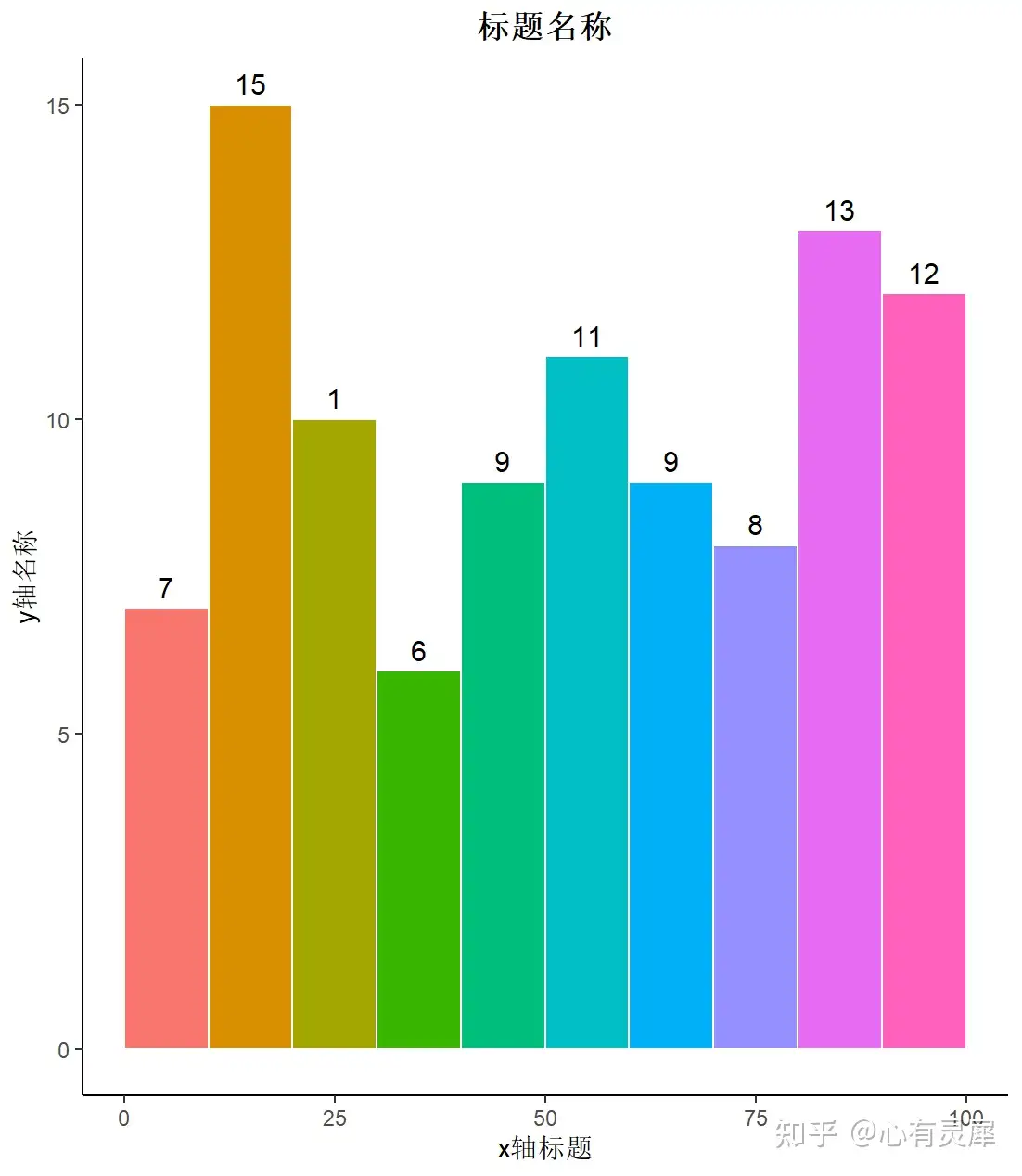
library(ggplot2)
# 创建数据框1到100的随机数100个
random = sample(1:100, 100, replace = T)
df = data.frame(random)

seq = seq(0,100,10)             # 提前设置区间
# 绘图
ggplot(df,
       aes(x=df[,1],
           fill=cut(df[,1],seq) # 添加颜色,填充依据是seq
       )
)+
  geom_histogram(breaks=seq,    # 设置break区间
                 color="white", # 柱子的边框颜色
                 size=0.5,      # 边框大小
                 stat="bin")+
  geom_text(                    #加标签
    aes(label=gsub("^0$", "", as.character(..count..))), # 内容为统计数字并去除0
    stat="bin",
    vjust=-0.5,                 # 垂直位置
    size=4,                     # 标签大小
    breaks=seq)+                # 标签位置
  theme_classic()+
  theme(
    legend.position = "none",   # 隐藏图例
    plot.title = element_text(  # 标题居中并加粗
      face = "bold",
      hjust = 0.5)
  )+
  labs(                         # 调整坐标轴名称
    x = "x轴标题",
    y = "y轴名称",
    title = "标题名称"
  )